Uli's Web Site |
![[ Zathras.de - Uli's Web Site ]](http://zathras.de/angelweb/themes/barsnstripes/img/masthead_blog.jpg) |
|
Uli's Web Site |
|
|
| blog |
15 Most Recent [RSS]
More... |
Spacing, boxes, and other layout things
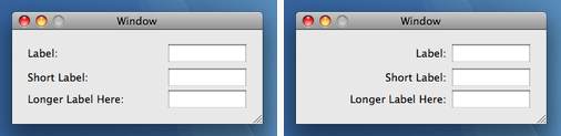
One of the aspects of user interface design that many programmers have problems with, is actually laying out user interface elements on the screen. So I thought I would post a little crash course for programmers interested in the subject here. First, there is the basic principle of laying out elements in a way that feels natural to the user. This begins with placing labels next to items in a way that makes it obvious which label applies to which user interface element (often that means right-aligning label text to make sure it is close to the labeled item). The next step is actually laying out the elements and their labels (as a unit) so the user can scan and navigate them naturally. In western culture, you want to place items starting in the upper left, and then proceed in reading order towards the right and down.
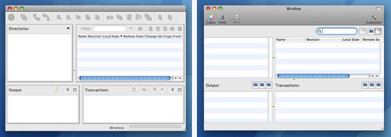
But which items should be the first ones, and which items should follow later? There are several approaches depending on what kind of program you are writing: in general, you will want to lay out items so they are ordered by importance. Really important items go in the upper left where users will see them right away, less important items will follow farther down. And of course this doesn't just apply to items within a window, this applies to the whole GUI: Your main window (if any) is the most important and most precious part of your UI. Put the most important stuff there, the stuff the user needs to see, access or manipulate the most or fastest. Other windows on screen aren't as important, particularly if they can be hidden and thus might need to be re-shown to access. The menu bar is in between: It always requires at least two clicks, but the overhead is constant, and it's easy to hit. If you keep this hierarchy in mind, you can make sure that important items are always right at hand, and that more advanced items are initially invisible (e.g. in a window or a menu) and only get shown when the user starts looking for them. But once a secondary window is visible, it's almost as easy to access as the main window. Thus, the user progressively sees more and more of the application, and exotic or confusing features can be almost hidden away, while not sacrificing too much of the access speed that power users demand even more than beginners. Whether it's about items in windows or across windows, order and arrangement is important. In some cases, the problem domain dictates the order of the items. For example, if your application is supposed to be the equivalent of a paper form which your users have a lot of experience with, you may want to maintain the order they are used to. (Of course, this is assuming that the form actually has a good order already, otherwise your application may lose all advantage over the form if it sticks too slavishly to its format) In other cases, the way your users will be using your program will dictate how you lay out your items. For example, at the cash register, the first step will probably be sliding all items over the bar code scanner, so you would want the barcode field to be the first one (of course, if you at all can, you will want to avoid imposing a fixed order on your users, and try to create your program in a way that the order can be decided on by the user). Once this is taken care of, you will want to actually choose how to group the items. Grouping is important so the user can actually locate the different areas of your application more easily. However, many developers think grouping means placing group boxes around items. In general, you will want to resist the temptation to use lots of lines to separate items. Whenever the eye tries to assess the contents of a window, it has to quickly scan over all the lines and elements of the window. If you use lots of boxes and lines to actually group items, these will serve as additional distraction to the eye. The eye will have to recognize the lines, and then decide whether it is an actual, usable element, or just a box grouping together other items. To avoid this additional processing, you can take advantage of the natural grouping aspects of certain items. For example, if you have a list box, it already is a box. So, instead of placing the group box with the title around the list box, just place the title immediately above the list box itself.
In addition, consider that grouping can be achieved by placing space between items. Empty space is special, in that the human eye has to jump over it, and thus pause, however, the brain knows it is nothing, and "optimizes it out". This way, you can split the user interface into separate parts that are easily recognized by the eye. By grouping related items, the user can often just look at the first item in a group to recognize what functionality she will find there. Also, don't discount item size as a tool to group items. Bigger items dominate a user interface, while smaller ones may be initially overlooked. You can use that to your advantage. If your application manages lists of stuff, those lists will typically take up the larger part of your window, thus drawing the user's eye and making it obvious that these items are important. Only after that, the user will notice whatever's in the upper left, or beside or below the list. You can use this to direct the user's eye, to intuitively give them a tour of your app's abilities, without swamping them with lines, labels and boxes. This means that not only will your user interface look prettier and cleaner, will also be faster to categorize by the user. Your application's functionality will seem less daunting and thus your application will be easier to use. Update: Added paragraph on progressive disclosure, fixed a typo. Update: Added a few pictures to make the point more obvious.
| ||||||||||||||||||||||||||||||||||||||||||||||||||||||||||||||||||||||||
|
Created: 2007-12-16 @828 Last change: 2008-08-17 @874 | Home | Admin | Edit © Copyright 2003-2026 by M. Uli Kusterer, all rights reserved. |